Miller Rosenfalck
Miller Rosenfalck was a specialist firm of European business lawyers fielding a highly talented team of bi- and trilingual solicitors, most of whom are qualified in at least two jurisdictions.
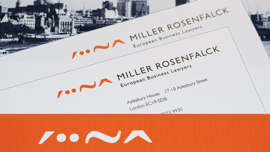
This was a fast-moving firm whose life-blood is innovation, but they looked dull with their ubiquitous ‘law firm blue’ identity and their uninspiring website. They needed to communicate their brand values and reveal the real Miller Rosenfalck – a successful, energetic young firm punching well above its weight.
We developed an exciting new identity, combining corporate gravitas with an interesting and unusual logo device – a row of four distinctive shapes based on European accent marks; an acute, an umlaut, a tilde and a circumflex. The new look was innovative, distinctive and memorable.
The rebrand proved highly popular – especially the website with its dual navigation and striking images of London cityscapes.
Some years later, with the adoption of a new name, ‘ebl miller rosenfalck’, we revised the corporate identity and re-skinned the website to bring it into line with the new house-style.